Blues and greens in cotton and flannel.


Blues and greens in cotton and flannel.
This quilt is for the little brother of my fall quilt. I finished it a few months ago, but I’m just posting it now.
 The dark blue binding fabric here is a major color field on the other one. I wanted the brothers’ quilts to be connected, but have their own color palettes, so I focused more on greens this time.
 I’m crazy about the batik floral! It was given to me by an acquaintance who traveled to Indonesia regularly. The blue reverse pattern reads as trees, but it also reminds me a little of waves.
 It’s hard to see -even in person, if you’re not looking for it- but the ripple stitching gives way to quilted vines and flowers in the floral sections.
 Time to snuggle up!
This quilt is for some friends’ little girl, due in April. As before, I used minimal patchwork, with more emphasis on the stitching, which I like.

The fabrics are all cottons (ie. durable and washable). After washing, it measures 35×42″, which will be big enough for a toddler to drag around. The tan and ivory polka dots are from Nani Iro. I love how sweet and minimal it is. The foxes on the front are a little mischievous, and there are crickets hiding in the clover fabric on the back. Do you see them? (Look for the eyeballs.)


The binding is the same orange as my last quilt. I had some left over and liked it with these fabrics, too. I think it brings a nice pop of color to the neutral side.

I’m very pleased with it. (I forgot to mention that about the last one. I was pleased with it, too!)
I spent some time this fall making a quilt for a friend’s little boy. I haven’t made very many other quilts, but I like a minimal approach to patchwork. The bottom 2/3 of the front side is navy and gold (below). The upper 1/3 is two lighter blues. The navy/ sea portion contains a gradation of stitched waves (most visible in third photo), close together near the horizon and fading toward the bottom.

The light blue/ sky portion is stitched with unevenly-placed stars/ twinkles. (below)

On the back is a herringbone printed fabric from Nani Iro. I’m always so pleased to get to use one of Naomi Ito’s lovely fabrics.

The warm orange binding really makes the blues pop.
The fabrics and batting are all cotton. The whole things is machine wash- and dry-able. At about 3ft x 4ft, the quilt is little enough for a crib, but big enough for a toddler, when he gets that big.
Graphite on drawing paper and bristol


Berkshire, Saddleback, Tamworth and Guinea Hog
Graphite on newsprint or sketch paper


Like with the chicken sketches, I was practicing body language, light and the particular differences in shapes and markings between breeds. The breeds, in order, are Ossabaw, Basque, Large White and Red Wattle.
Graphite on drawing paper

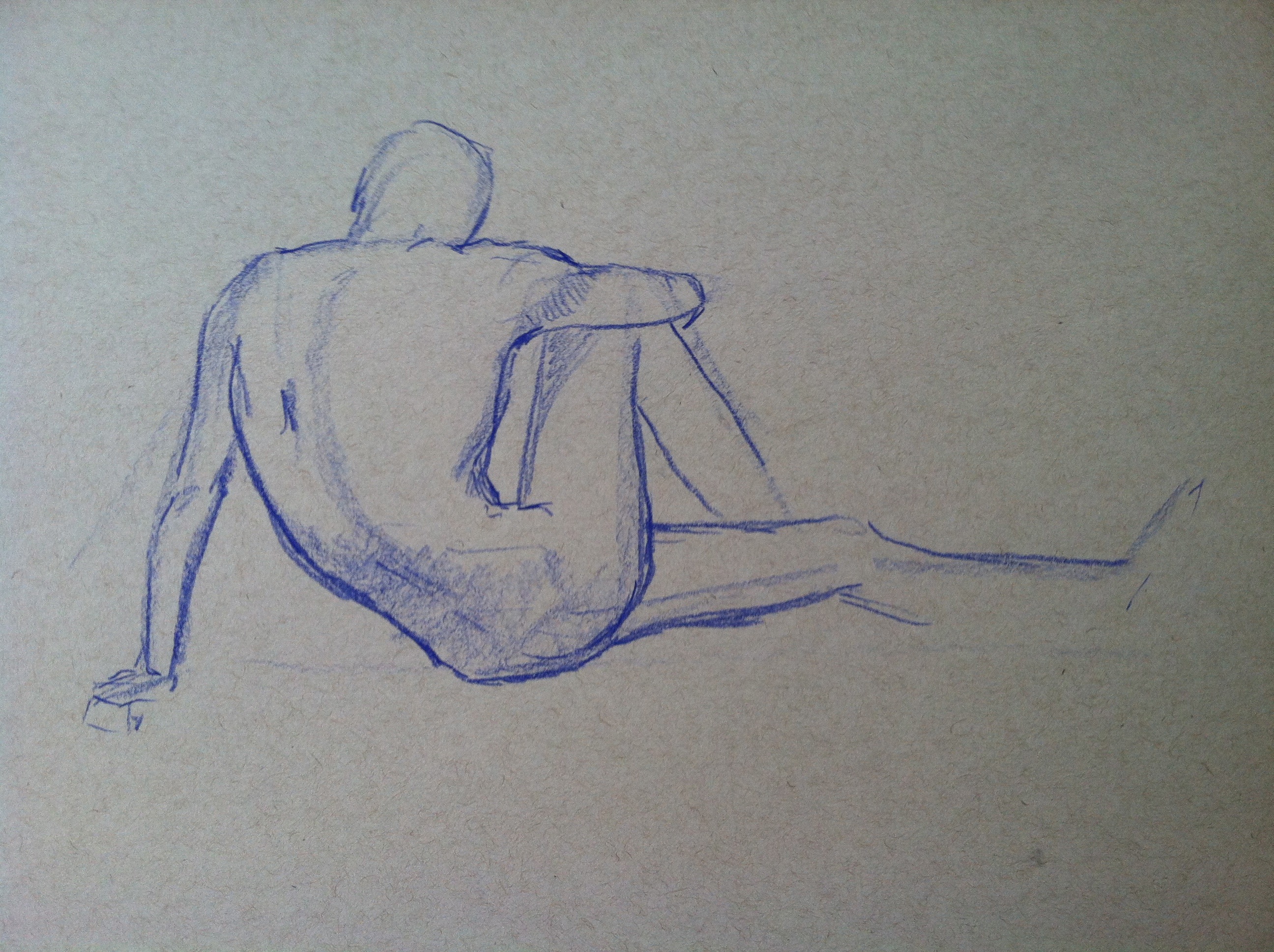
Graphite or colored pencil on newsprint
The gesture drawings were an exercise to learn their body language. The slightly more finished ones were about light and feather texture.


These were all done with graphite on newsprint or toned sketch paper. The women were drawn from photos. The man was drawn from life during a figure drawing studio session. I’ve posted them here in rough order of time spent per drawing.